One of the trickiest ideas for photographers to get to grips with is Color Spaces (I’m going to use the US spelling here because most of the software does …)
Just a warning – you’ll probably reach a point in the article when you think “But that’s stupid. Why would they do that ?”. Sorry, but life’s too short to get into that one.
Also : I’m only dealing with web display in this article. Printing is another matter altogether, and there are some really good tutorials out there.
What does it matter ?
So … what’s the difference between sRGB, AdobeRGB and ProPhoto RGB ?
Well, most colour digital images are stored and described using values between 0 and 255, for each of the three primary colours – Red, Green and Blue (which is where RGB comes from). So rgb(0,0,0) is black, and rgb(255,255,255) is white.
It’s the bits in between that get tricky.
Rather confusingly, the same rgb values can be displayed differently – or (to put it the other way around) different values may be needed to display the same results.
That’s because the way in which “output devices” (which includes screens, printers and – for example – projectors) actually render these values depends on the “Color Space”.
This can be useful : not all output devices can print the full range of colours, so describing with a narrower “gamut” (the range of colours that can be described by a color space) may mean that the brighter colours don’t display, but more subtlety is available for nuances in the middle range of colours.
None of this is a problem if the software displaying the image understands the different color spaces, and can reproduce accurately.
But not all software does. Specifically, some older browser versions don’t.
So, for example, here’s a screenshot of the same image, output in three different color spaces, rendered in Internet Explorer 8 (and there are still people using older versions).
(Just to emphasise : on my desktop, they all look pretty much the same).
This is a screenshot of how they appear in the browser:
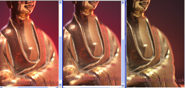
The colours in sRGB are clearly more vibrant – and are closest to the original. Some of the more vibrant colours are lost in Adobe RGB, but the browser clearly hasn’t much idea about how to render ProPhoto RGB – it just treats it as if it’s sRGB.
Now, I’ve had to go back to an old machine to create this – my current browsers work fine. So if you’ve kept your software up-to-date, you might have no way of knowing that your lovely bright colours are muddied up for some of your website’s visitors.
Over time, this should become less of a problem, but I suspect we’re still a few years away. And, to be honest, it should do no harm to standardise on sRGB as an output. It’s not necessarily the lowest common denominator, but it is the de-facto common denominator.
So … just stick to sRGB, for the whole process ?
That’s an option, of course, but before you get there – when you’re post processing – you can still work in the wider gamuts..
(Note :The software is normally less constrained, but your monitor may be.)
Then, remember that when your software “shrinks” your image (to, perhaps, 2% of its original size), it has to make decisions about which colours to put in each output pixel – and it may well average those out. So the more accurate the information it has to make that calculation, the better.
Set up a Lightroom Preset
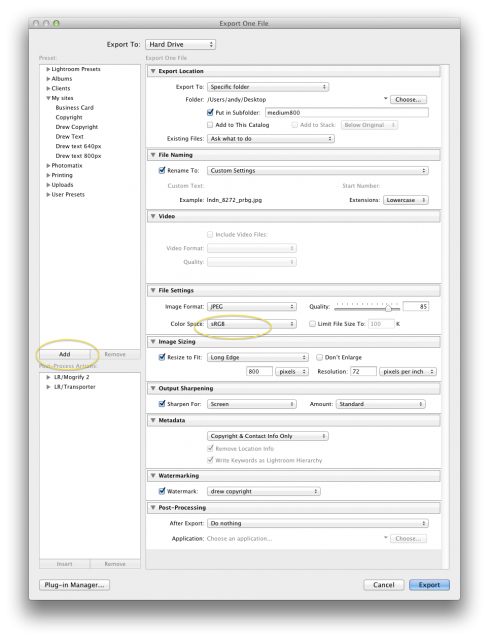
The easy way to sort this out – if you’re using something like Adobe’s Lightroom – is to set up a preset to output your web images (you can override it, of course, if you need to).
So, when you’re ready to export, create your settings. I’ve highlighted the “sRGB” item.
Just to explain some of my other web settings :
- I set the quality to “85” – this saves lots of filesize. And, as a result, it saves your site visitors lots of bandwidth, so they don’t get bored waiting for your photos to download.
- Resolution of 72 pixels is about right for screen displays. And 800 pixels gives a reasonable sized image.
When you’ve got all of your settings set up, click on the “Add” button (highlighted) to create a new preset.
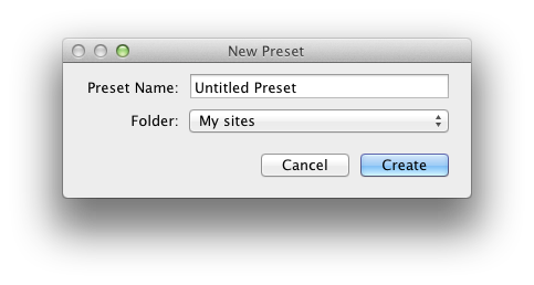
Then you’ll be prompted for the new preset details.
You can group your presets into folders (Clicking on “Folder” will let you set up a new one).
Extra credit :
If you want a more detailed, technical explanation on color spaces, then there’s a good post on the excellent Cambridge In Colour website.